…but you probably won’t be able to take advantage of them because native Push Notifications are still in beta so developer Iconofactory had to limit the much-needed feature to the first thousand users, as determined on a first-come, first-served basis.
The system is very similar to the reservation tickets in the Mailbox app. Luckily, I was able to reserve my spot on time so my copy of Twitterrific version 5.2 has native push alerts turned on.
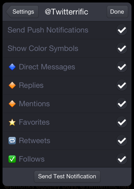
Tucked away under the app’s settings, push alerts can be turned on and off individually for direct messages, replies, mentions, favorites, retweets and follows.
Another handy treat: each of these can be color-coded so you get a better idea of a particular notification’s importance after it appears on your screen, especially handy when these alerts start cropping up on your Lock screen…
Those out of luck can “just try again in a few days,” Iconofactory’s blog post advises.
Push alerts are enabled in Twitterrific’s in-app settings from the sidebar. After turning the feature on, you’ll be presented with a number of new options, as depicted on the top right screenie.
To test if enabled push notifications are working, hit the Send Test Notification button at the bottom of the screen. Those unable to turn on push notifications right away can download the free Boxcar app and configure it for use with Twitterrific to receive push notifications.

This version of Twitterrific also sports a number of under-the-hood tweaks and features a host of nice-to-haves and little things that matter, here’s your full changelog:
• user banners now display on profile pages
• discussions can now be shared via email or Storify
• added Droplr thumbnails to the timeline
• text size of muffled items scales according to theme settings
• the timeline can now display up to 600 tweets (was 400)
• additional actions, like muffling, are available when avatars are hidden
• new compose shortcut: type “@” after username to prevent autocomplete
• load more button now animates while loading new tweets in the timeline
• improved behavior when restoring selected timeline with multiple accounts
• improved formatting when emailing a tweet or group of tweets
• improved performance when rotating display on iPhone/iPod
• improved display performance when muffling many items
• multiple in-app notifications no longer overlap
• various changes to make VoiceOver less verbose
• various other UI tweaks
When I browse my timeline, I don’t want visual bells’n'whistles to distract me from content at hand. Luckily, Twitterrific packs in some world-class design so the app admittedly delivers exactly the kind of focused experience I’m needing.
I’m a big fan of Iconofactory’s design work on the Mac side and Twitterrific is a prime example of their design approach: the app’s flat look with large and elegant typeface is a sight for sore eyes, especially after other graphics-heavy apps.


Further refinements include a choice between light (above) and dark (below) UI theme.


Even though TweetBot is still my default go-to Twitter client on the iPhone and iPad, push alerts – along with other changes instituted in today’s update – have made Twitterrific a whole lot more useful, so much so that I’m now increasingly jumping between TweetBot and Twitterrific throughout my day.
For a more detailed overview of other changes in this version of Twitterrific, including Droplr suport and tweaked profile pages, I recommend Cody Fink’s nice hands-on article over atMacStories.


0 comments :
Post a Comment
Share your ideas with us .. let us know your thoughts about this .